Green Lake Park in Seattle is known for its lush greenery, water activities, and amenities. However, the current design system lacks clear park rules, effective navigation cues, and cohesive visual elements. The Green Lake Park Design Project aims to address these issues.

Role

  • Researcher
  • Art direction
  • Branding
  • Illustrator

Tools

  • InDesign
  • Illustrator
  • Photoshop

Duration

8 weeks

Team

Solo

Problem & Solution

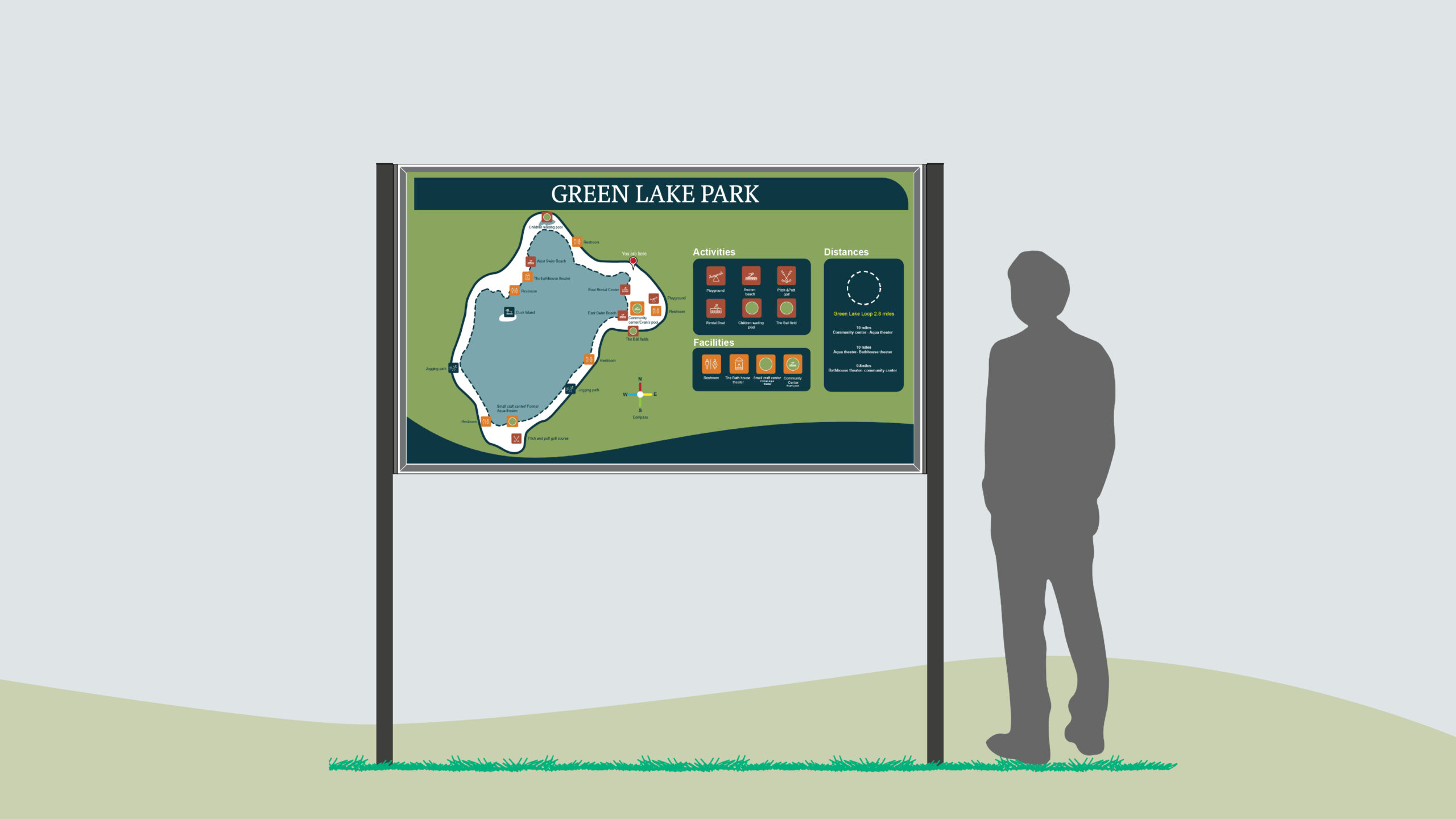
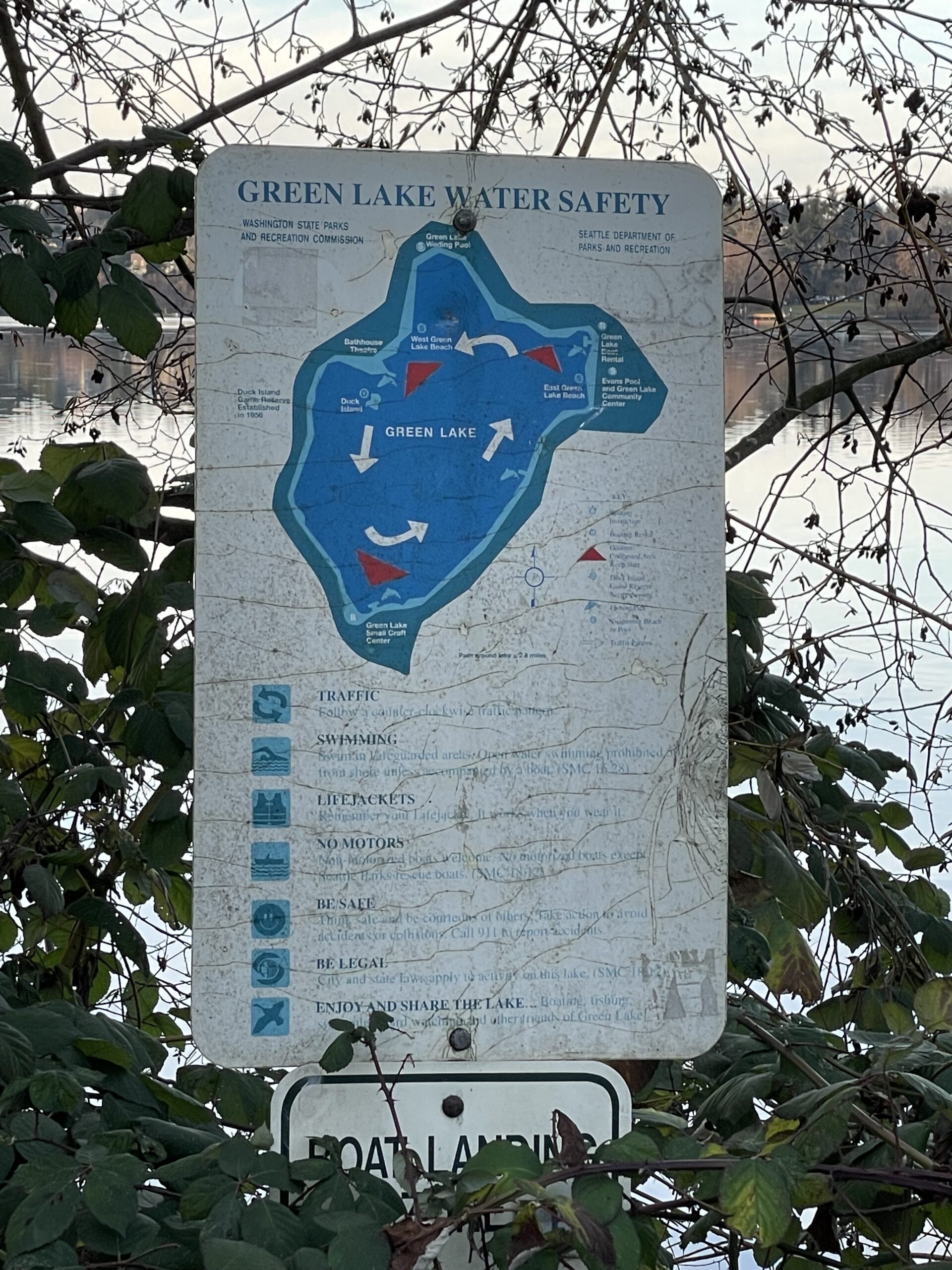
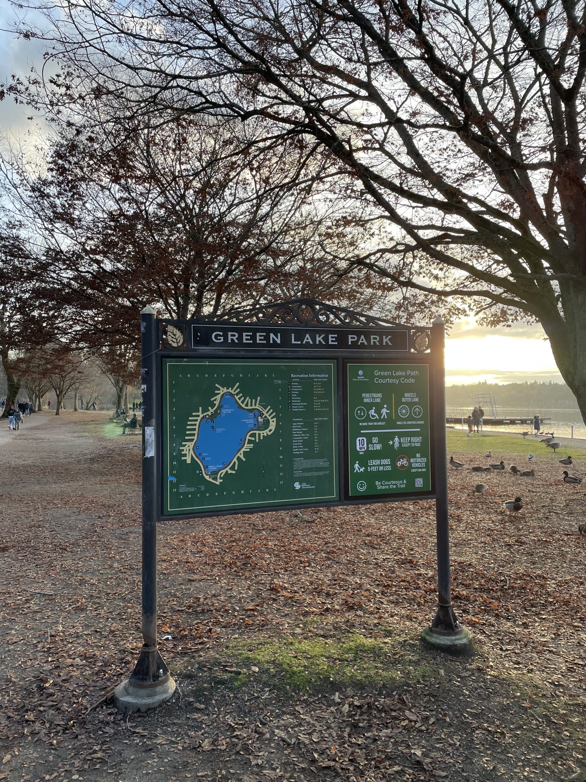
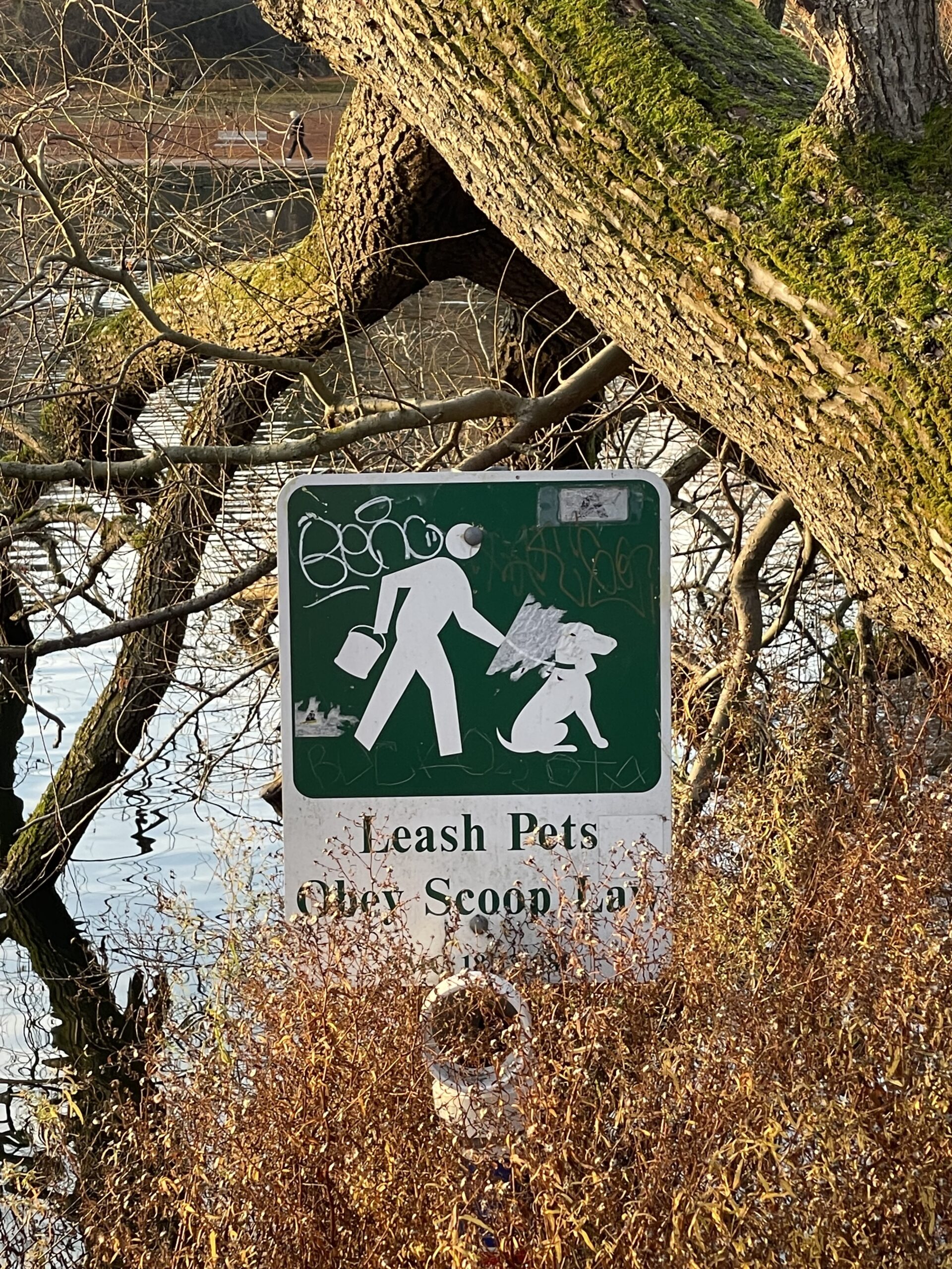
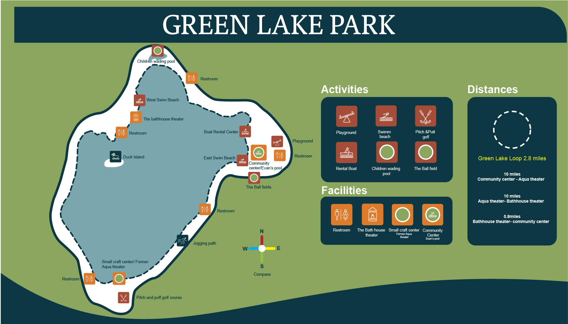
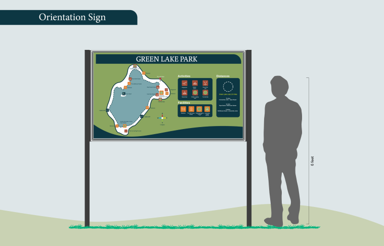
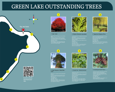
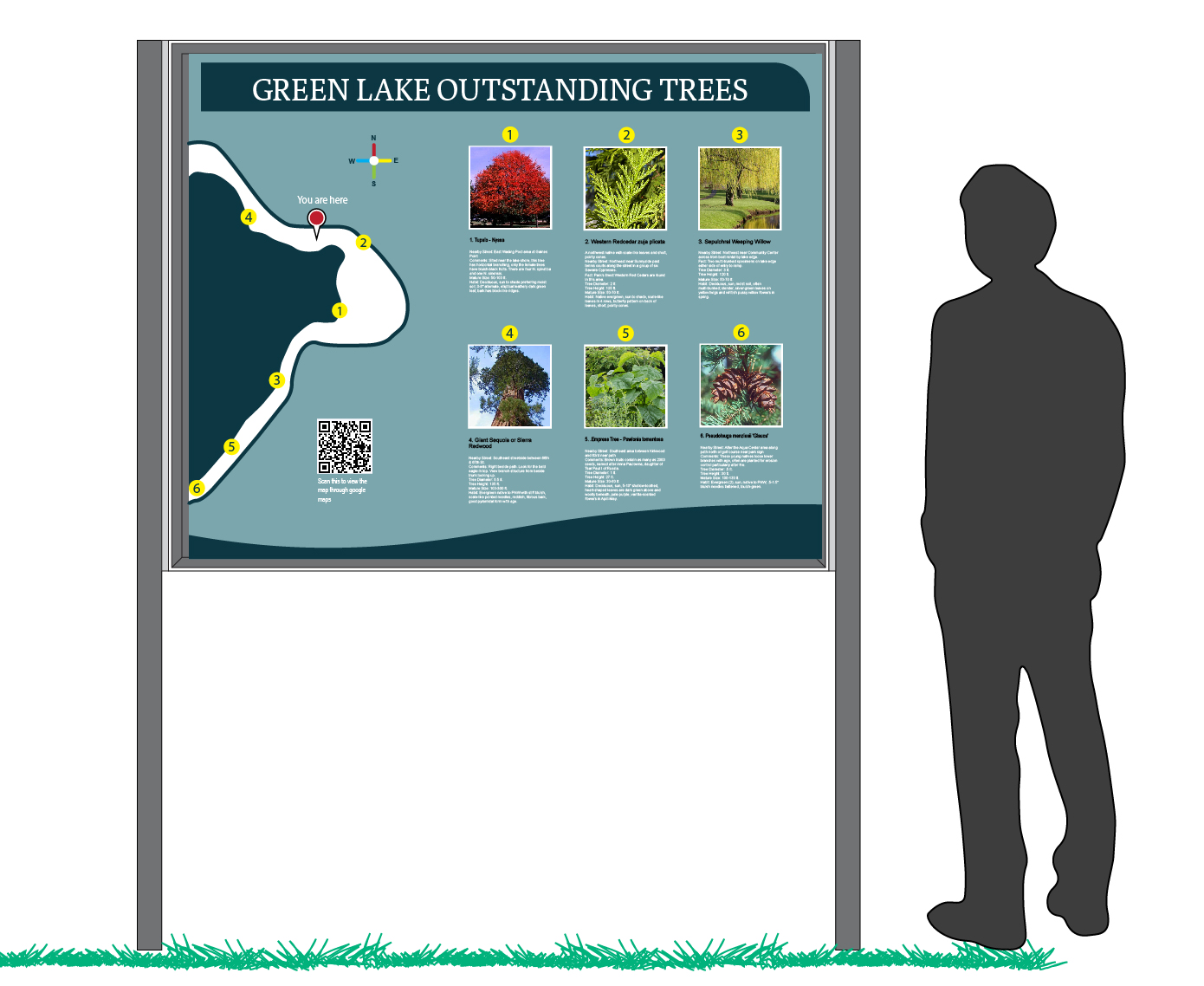
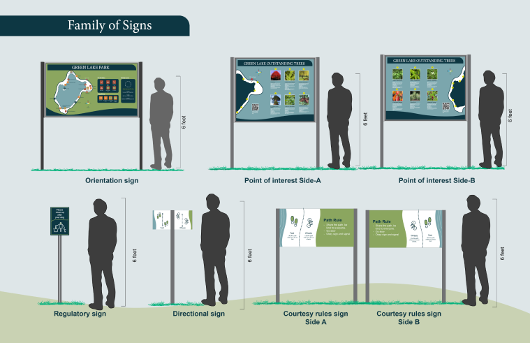
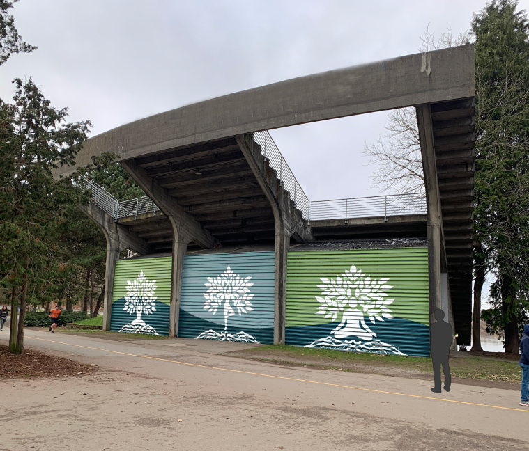
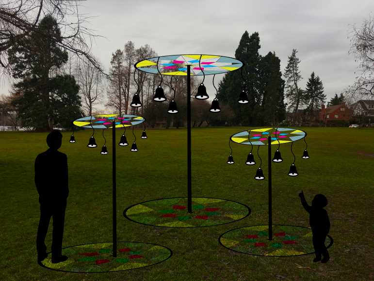
The problem with Green Lake Park’s current wayfinding system is its outdated with unfriendly typography, unclear icons, and an overwhelming map. The solution involves a redesign of the wayfinding system, prioritizing accessibility, clear communication, and a playful aesthetic, along with the addition of interactive public art installations. This combined approach will improve navigation, provide engaging landmarks, and enhance the overall visitor experience at the park.

Research

During my research, I visited Green Lake Park to gather firsthand information. I took photographs of existing signs and maps, observed visitor behavior, and noted their needs and pain points. The lush greenery and vibrant vegetation of the park inspired me, leading me to adopt a “greens” theme for my design concept.
Green Lake existing Signage

Process

To kickstart the design process, I outlined the necessary tasks: developing clear, playful, and engaging signage; selecting welcoming typography and consistent icons; incorporating accessible color contrasts and clear hierarchy for effective communication. Additionally, I planned to enhance the visitor experience through interactive public art and place-making, inspired by the park’s vibrant greenery.

I carefully chose colors for the design that were inspired by the park’s abundant greenery and the peacefulness of Green Lake. To ensure information is easily readable, I selected a typeface that is clear and accessible. To establish the overall look and feel of the design, I created mood boards that show the desired visual style. Additionally, I compiled inspiration boards to capture the unique character and attractions of the park.

Finished Design

Icons
I made sure to use thick lines for the icons in my design. This helps make them more noticeable and easy to understand. I kept the line thickness consistent throughout all the signs to create a cohesive look. This way, visitors can quickly recognize and interpret the icons, making it easier for them to navigate the park and understand the information being conveyed.

Green Lake Map

In the Green Lake map design, I incorporated icons of different colors along the path to distinguish between various facilities and activities. This color-coded approach allows viewers to easily identify and locate specific amenities and attractions along their route.

Point of Interest Sign
This informative sign is designed specifically for visitors exploring Green Lake Park, providing them with valuable insights into the park’s remarkable trees and their locations. The sign features two sides to engage and educate park-goers.this sign contributes to a greater appreciation of the park’s rich history and offers an immersive experience in the wonders of nature.

As part of the park redesign, I focused on creating a cohesive visual language across various signage types, including orientation signs, point of interest signs, regulatory signs, courtesy rule signs, and path rule signs. By adopting a consistent style throughout, I ensured that all the signs harmoniously blend together, enhancing the overall park experience for visitors.

Rooted in Nature: A Yoga Mural (Located at small craft center)

This mural would add a unique and engaging element to Green Lake Park, highlighting the beauty of the natural environment and encouraging visitors to engage with it in a playful and interactive way. The mural would depict various yoga poses intertwined with the natural elements of the park, showcasing the connection between the human body and the natural world. The depiction of yoga poses would inspire viewers to try the poses themselves, further engaging them with the environment and promoting physical activity.

Tinkling Tires

A public art installation featuring bicycle tires and bells hanging on them would be a playful and interactive addition to any park or public space. The installation would engage viewers by creating a sense of playfulness and whimsy. Visitors would be able to interact with the artwork by ringing the bells and spinning the tires, creating a fun and engaging sensory experience. The use of bicycles in the artwork would also promote physical activity and a sense of exploration, encouraging visitors to explore the park and their surroundings.
Material Used- Bicycle tires, stained glass and bells.
Height- 96 inch

Reflection

Throughout the duration of this project, I had the opportunity to engage in environmental design at Green Lake Park. It was an enriching experience as I focused on creating a signage system that not only enhances the visitor experience but also aligns with the park’s natural surroundings. By incorporating elements inspired by the park’s lush vegetation and serene atmosphere, I aimed to create a harmonious and sustainable design solution. I am delighted with the final result, knowing that the new signage not only improves navigation but also complements the park’s environmental aesthetics.

See More